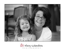


I am looking forward to playing around with it...looking strickly at the concepts here...not necessarily the colors....help me out here...I have one vote for the box one....let me know what you think...I am leaning towards a green box...still playin...


10 comments:
I like the green box. Funny, that's the same font I had used when I was playing around with a logo. Scriptina, right?
I like the black one. It looks weddingish!!
Cindy
I agree with Cindy. I think it looks very professional.
Hey Stacy! Very nice! I really like number three and number four best. I'm partial to circles, so the black one really stood out to me.
hey Stacy - the green box says playful and a little more casual than the black circle which looks a little more sophisticated... i like black, but that's just me! depends on what you're going for :)
danielle
well, i'm with you and i like the green. the first one is very fun!
Personally - green all the way....looks much warmer, more creative.....the black looks like a caterer to me. I LOVE the letters and font.
Love and Kisses.
Lisa
I just have a feeling about purple this fall. I think dark purple is gonna be where it is at...but then, you can't go changing the color every time a new season comes, can you?
Nancy:)
I like the first one and the one with the black circle - love the font and style on all of them though!
Black on green was sweet. Gotta vote for that one.
Love,
LOAB
Post a Comment